How NOT to build a BlackBerry Java Application

Posted: November 9, 2009 | | Categories: BlackBerry
As the smartphone app stores become more prevalent and of course all of the app pressure from the iPhone, more and more developers are trying to create these really beautiful and really feature full applications. Apple has done this to all of us and it flies in the face of how you should really build mobile applications.
The smartphone has limited battery life, limited processing capacity, limited memory and limited network capacity available to it. It does, it really does – but were being made to believe none of those things are important because of the way all of these apps are being made. A smartphone application, or at least an enterprise smartphone application, should have as few bells and whistles as possible – the application should be crafted so the application is at least good looking, easy to use (without requiring an instruction manual or training) and the user has access to the exact data they need, when they need it and nothing more.
Smartphone applications should work regardless of whether a network connection is available or not. If can have less functionality when disconnected, but it should continue to work – using the locally cached data available to it.
I'm at the BlackBerry Developer Conference in San Francisco this week (look me up if you're there – my published will be selling copies of BlackBerry Development Fundamentals and I'm going to be signing copies of my book at the conference Thursday during lunch) and before I left I installed the free conference RIM provided for attendees. I expected RIM to use the Viigo application again like they did last year, but instead I found that they apparently engaged someone else to build this year's conference application. It's too bad, because the Viigo application is pretty cool and has usefulness outside of the conference and this new conference application is pretty horrible. The application is however a great example of how you should NOT build Java applications for BlackBerry devices. Let me explain…
The application is installed from the BlackBerry App World which is cool and is what I would expect from any mainstream BlackBerry application released in 2009 and beyond. It's when you go into the application that you notice that the people who developed the application really didn't know what they were doing. The application wasn't crafted for a mobile user to use at the conference; it was crafted to show off the cool capabilities they have built into the application.
When you first launch the application, a splash screen fades in (showing the conference logo), sits there for a while, then fades out again. If I'm an attendee at the conference and I'm trying to look up something (like where I need to be next) this long delay in opening the application just to show me how you can make a cool fade-in effect is a waste of my precious time and places an extra drain on the battery. Think about it, I'm at a conference going from session to session sending emails, making phone calls and generally using my device heavily. On top of that, with the expected 1,000 people at the conference, it's likely that cellular wireless network coverage is going to be in high demand. I don't know if you knew this, but the BlackBerry device (and most smartphones) drain their battery at a more rapid pace when it has difficulty getting or keeping a wireless network connection. So, as I'm sitting at the conference draining my battery at a higher rate because of an overloaded local network, the application is shamelessly wasting even more battery life. Now, don't get me wrong, wi-fi should be available, so I'm not worried about data traffic – but when the voice network gets congested (as I expect it will) batteries start to drain.
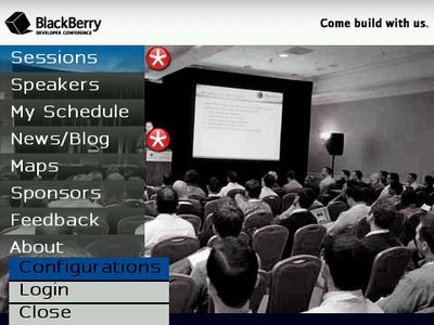
OK, when the splash screen finally fades away and I can get into the application I'm presented with the screen you see below. They've selected a VERY busy background and used these battery wasting scroll-in effects for the menu so it takes even longer before I can begin working in the application.

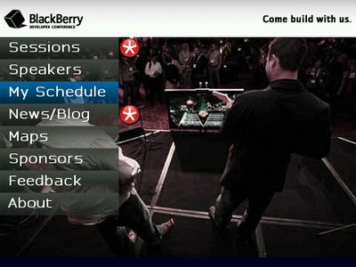
As you scroll from menu item to menu item, the application uses this smooth fade-in ad fade-out for the selected menu item then changes the entire background image (as shown in the following figure).

OK, so not only do I have a very busy (too busy) background image for the application, I have to wait as the application applies fancy effects to the menu and swaps out the complete background for the application. Yet another waste of my time and a huge waste of device battery life. Developers should not add screen effects that slow down application performance for the user. If you can implement them without affecting the user, great – otherwise leave them out of your application.
I'm an older guy and my eyesight has been deteriorating lately (not too bad, but enough to be annoying) and the dark menu against the busy background makes it very hard for me to be able to read the screen without my glasses on. Developers should always pay attention to how the background affects readability and usability for the application. Complicated or busy background images just don't belong in any mobile application.
Notice by the way that in the pop-up menu (the menu you get when you press the BlackBerry menu key) the option for 'Configuration' is misspelled. I'm assuming this is because the application was created by one or more developers for whom English is not their primary language. Any time you build an application that will be consumed by others, you have to make sure you spell check all of the menus, field labels, help pages and content.
For the first couple of times I tried to select anything, I went past the menu item I wanted because it was so unresponsive. When you're finally able to get to the menu item you want (I'm serious, it's very, very slow on my BlackBerry Curve 8900) and you're looking at content, the developer did not follow RIM's standards for BlackBerry applications. Let me give some examples:
- When reading content, some of the standard navigation keys seem to work (such as 't' for top and 'b' for bottom) but you cannot press the space bar to page through content. So, experienced BlackBerry users, ones who know how to quickly get to the content they want, won't be able to use standards they already use in other applications.
- The BlackBerry menu button is disabled in all of the content screens (about, event listings and more). So, if you are used to switching applications using the menu, you're out of luck. If you want to select some of the content to paste into another application, you're out of luck. If you want to invoke some third party menu item (like the screen shot capabilities of BoxTone Expert) you're out of luck.
Developers should ALWAYS build their BlackBerry applications so they work like every other BlackBerry application or at least all of the applications that come with the BlackBerry. Omitting standard features like keyboard shortcuts and the BlackBerry menu is a serious crime when it comes to BlackBerry applications.
When looking at the about screen, the developer used some sort of special library to make the content scroll very smoothly. I'm sorry, but that's just not needed – the BlackBerry platform provides a field you can use to display content and the BlackBerry device manages scrolling the content for you (including I believe allowing you to use the space bar to page through the content). Adding addition capabilities to an application that are already provided by the core platform is a waste of memory, processing time and battery life. There's no need for special stuff like this, all it does it make it take longer for me to be able to page through the content (it's so busy making the scrolling smooth that it's slower than it would be otherwise).
When you look at the content on screens, the developer did not make any effort to match the application's fonts to how I have the device configured. As I mentioned earlier, I'm a little older and I need a larger font. I've set the BlackBerry screen options to display text in a size that allows me to read it without digging out my reading glasses. In this application, the developer has selected the font size and I find it very hard to read. If I go to the Configurations (that should be Configuration, but they forgot to check spelling) screen, there's no option for setting the display font. Developers building applications should pay attention to what settings the user has for Screen and Display options and act accordingly. Deciding for me what screen font size to use would work for many users, but for those of us who don't wear glasses all the time but need help, the application is all but unusable.
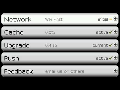
Take a look at the application's configuration screen; I don't understand why developers feel the need to build special screen elements for configuration screens. This one is just like the main screen, a slow and unresponsive menu system that doesn't add any value. Why not just make a simple screen with the appropriate fields? Why take up the extra memory for all of these extra features? Why kill the battery life by forcing the user to go through all of these custom menu and field animations when the ability to have normal, everyday fields is built into the platform? In later versions of the BlackBerry Device Software, RIM added the background factory which allows developers to easily place a screen or field background in their applications – there's no need for all of this extra junk – it adds no value for the end user, all it does is allow the developer to show off and it's just wasting my time (and battery performance).

The developer of the application is Sweet Caesar Inc (https://sweetcaesar.com/){target="_blank"} – I'd suggest that they spend a little more time making their application usable and less time making it pretty. There are going to be 1,000 people in San Francisco this week cursing their product every single time they use it. Not a good thing for a company's reputation.
Next Post: Pictures in Our Heads
Previous Post: Internet Scam 2
If this content helps you in some way, please consider buying me a coffee.