 John M. Wargo
What Were They Thinking 4

Posted: December 17, 2009 | | Categories: Mobile Development, What Were They Thinking
My company recently asked us to install and use an application on our BlackBerry devices and as soon as I saw the application icon, I knew I had another topic for my 'What were they thinking' series. Please take a look at the following BlackBerry screen shot:
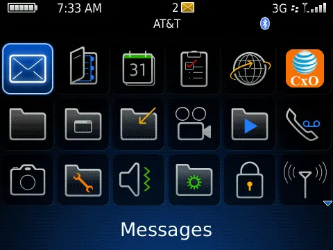
If you take a look at the last icon in the first row, you should be able to easily tell that it just doesn't match the look of all of the other icons on the device's home screen. When working with the Apple iPhone or Windows Mobile devices, there isn't really any adherence to any theme when it comes to application icons. On the BlackBerry platform on the other hand, the icons on the home screen are designed specifically to look similar to all of the other icons in the theme - mostly because it's a theme and that's how themes work.
When building application icons for BlackBerry devices, it's a good idea to make sure your application icon matches the 'theme' of the default theme for the particular device. I know this means more work for the developer, but if you don't do this, you end up with screens like the one shown above.
The reason this is a problem for me is that, because of the way the developer designed the application icon, every time I looked at the device, it looked to me like the bright orange icon shown in the figure was the currently highlighted icon. Every time I looked at it, I immediately assumed that was the one highlighted and tried to move it off of that icon to the application I'd intended to open. Every time (and I promise you it happened many, many times), the 'Profiles' application or my 'Messages' application was actually the selected icon and I felt like an idiot. You shouldn't use icons that contrast so starkly with the other icons on the device - the selected icon should be unique, but at the same time should blend in with the rest of the theme.
In this case, I'm sure it wasn't that the developer wasn't thinking. What really happened I bet was that the icon was the last thing added to the application right before it was released and the developer just threw something together so he or she could finish the project and move on to the next one. Considering the orange color and globe icon are synonymous with my employer, it's easy to see how that was what was selected in this case. Also, this application was created using one of the MEAP tools (I won't say which one) and therefore had to run across multiple platforms, so it's likely that's why a theme appropriate icon was not selected for this application. If it were me, I'd have made sure that the icon was less...standoutish (like a sore thumb).
Next and/or Previous Posts