What Were They Thinking 5

Posted: February 4, 2010 | | Categories: Mobile Development, What Were They Thinking
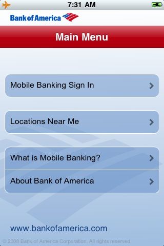
As part of my family's move to Charlotte, it was time to start looking for a new bank. We selected Bank Of America and proceeded to setup our new accounts. It occurred to me to take a look to see if the bank had an iPhone application and I was pleased to find that they did. I downloaded the application from the iTunes and proceeded to launch it. When the application starts, it presents you with the screen shown in the following figure.

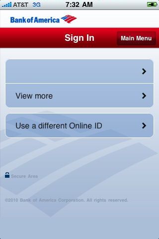
You can then define your account login information (including the same additional security measures Bank of America uses on their desktop browser application) and access all of your accounts and transactions. It's pretty cool and I like it. I'm not going to show you this with my own accounts (yes, I blanked out my login name in the figure below), but I'll describe it. What you see after you login is a list of your accounts. When you select an account, you're provided with a list of transactions and other information.

The only complaint I have about the application is that it's very sluggish – after you login and start navigating through the account information, the screen response is very slow. Whoever wrote the application apparently didn't know how to optimize the menu items and so on to provide the best user experience.
Where the What Were They Thinking stuff begins is when you look at the BlackBerry version of the application.
I didn't expect that there'd be a BlackBerry version of the app. It wasn't until I'd used the iPhone version for a while that I thought to look in the BlackBerry AppWorld for the app. Surprise of surprises – Bank of America also offers a BlackBerry application. So many times, vendors decide that all people care about is the iPhone application and skip other platforms. In this case, they are trying to accommodate multiple platforms. The problem is that they didn't implement the same features in the BlackBerry version of the application.
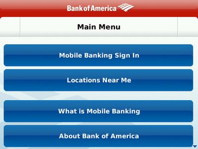
When you open the BlackBerry version of the app, you see the screen shown below.

It looks like the same features of the iPhone application. When you open the 'Locations Near Me' option, the application uses the GPS information available on the device to determine the location of the nearest bank locations – very nice.
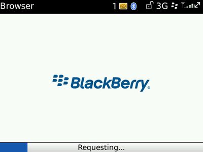
When you click on 'Mobile Banking Sign In' you'd think it will prompt you for your credentials and allow you to view account information (just like the iPhone app). Nope, that's not how it works here. When you select this option, you're presented with the following screen.

What???? The Browser? What were they thinking? The iPhone application shows an interactive list of accounts then allows you to browse the account transactions inside of a native iPhone application. The BlackBerry application launches the browser and gives you the exact same functionality you'd get if you fired up the browser and typed in bankofamerica.com in the address bar. The browser???
Eventually you get to the login prompt and you just have to deal with the mobile browser version of the site.

What's the point? It's essentially useless except for the branch finder. I just don't know what they were thinking. The bank spent the time and money to build a fully functional iPhone app but relegated BlackBerry users to a simple application that merely launches a particular URL in the BlackBerry browser.
Developers: Please don't do this. The functionality the application needs to call on the back end to get the account information and account activity clearly exists (the iPhone application is using it) and the BlackBerry platform supports the exact same application capabilities that the iPhone does (the same API's are generally available across both platforms) so why the difference? I bet it was harder to do for the BlackBerry and it will take them some time to deliver parity. I'm OK with that – UI's are just easier to build on the newer platforms (iPhone, Android). But the BlackBerry can call any service on the back end and process the data – just like the iPhone app. If it's too hard to build the long list of account transactions like used in the iPhone application, just have the server return the activity as HTML and render it in a BrowserField in the BlackBerry version. You'd still get the same data and you can make it look like the iPhone application although on non-touchscreen BlackBerry devices it won't be as easy to navigate. You could always intercept the click within the browser field and open up the selected account activity record natively.
Anyway, my personal opinion is that hybrid applications for the BlackBerry should be avoided at all times. If you need to launch the browser to provide your application with specific functionality then you're not really trying to build a BlackBerry app – all you're building is a shell program that uses the browser for its heavy lifting and I'm really not interested in using that kind of application.
Next Post: SugarCRM and FatCow
Previous Post: I Love it When Bob Cringely Gets Mad