 John M. Wargo
What Were They Thinking 6

Posted: March 17, 2010 | | Categories: Mobile Development, What Were They Thinking
For this installment of my What Were They Thinking series I'm going to pick on Research In Motion. Considering that they invented the whole smartphone market, they're usually pretty good about designing BlackBerry applications with forethought and an attention to detail. After all, they created the platform and they're responsible for maintaining consistency across all applications. Right?
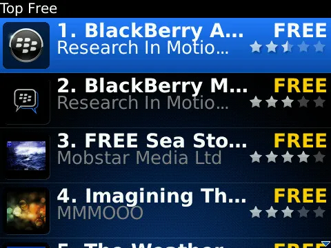
I was browsing through the list of free applications in the BlackBerry App World application yesterday and was struck with how hard it was to read the application names in the list of free applications. See the figure below for an example of what I saw:
When building a mobile application, you have to pay special attention to first of all how much data is delivered across the wireless network and how much work the application has to do to process and render the data. This is wireless application 101 stuff.
When you look at the application list, you'll notice that they've designed the application so you can see the application's icon (useful for branding purposes) but only a portion of the application's title. I don't know about you, but I can't tell what the application names are for these applications.
On top of that, take a look at how much screen space is taken up by the word 'Free' for each application. We already know it's a list of free applications – if we didn't remember that when we looked at the screen, we could have easily been reminded by looking at the 'Top Free' in the title bar. There's no need to show the word 'Free' for each application – they're all free. It's extra screen space that could have been used to allow more of the application name to display.
Since I can't read the full application name, I have to open each application to learn what the app name is – bad use of my time. There's also absolutely no reason why the application title can't wrap around to the next line. Who cares if it takes up an extra line on the display? If you look closely at the screenshot, you'll see that there's wasted space anyway underneath the application vendor name. They didn't try to scale the application icon to the available space used by the application title and vendor – what they should have done was kept the icon the same size and adjust the font sizes to allow three lines of text for the application title and vendor.
Which is more important, making it easy for the user of the application to be able to read the information on the screen or keeping all rows the same height? I'm hoping you will agree with me that the user is more important here. I don't mind if I can't read the whole vendor name, but I do mind that I can't tell what the application's name is.
What were they thinking?
Next and/or Previous Posts
<< Addendum to What Were They Thinking 6 Getting Ready for the View Domino Conference >>