What Were they Thinking 8

Posted: May 4, 2011 | | Categories: Mobile Development, What Were They Thinking
I'm at the BlackBerry World conference this week and I thought it was a good time to add an article to the What Were They Thinking series. The example for this article is the conference application for the BlackBerry World conference in Orlando. RIM has hired different developer organizations to create the different applications, there was the Sweet Ceasar applications commissioned for the BlackBerry Developer conference which used so many fancy screen effects that the application was unusable. What happens is RIM is trying to demonstrate how cool applications can be on the BlackBerry platform and encourage these developers to do all sorts of fancy things to highlight that. Unfortunately what you end up getting is something unusable and this year's BlackBerry World Conference application is no exception. When you focus on flash rather than functionality, the end user suffers.
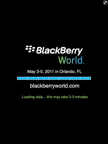
Take a look at the following screen shot; you'll see the warning that it will take from 2 to 3 minutes to load the data for the application. Unfortunately, this delay (and the corresponding warning) happens every single time you load the application (yep, every single time). I don't know about you, but no mobile application should take 2 to 3 minutes to start up; that's completely unacceptable.

Why do that? Why not cache some or all of the data? This approach essentially makes this application unusable. I expect that there's an expectation that you'll leave the application running during the day, but I don't use mobile applications that way. I use the application then escape out so I can recover some memory and not have a bunch of applications running in the background all the time. Steve Job's approach is to deny you an Escape button, so every application suspends when backgrounded, but it's much better (for me anyway) to just let me decide what happens.
What a developer should have done is preload the application with a default set of options then display an application's main screen and load additional data in the background. Let me at least work with some non-dynamic data or the data from a previous load instead of making me wait for a data load every single time the application launches.
Somebody wasn't thinking.
Another thing I noticed was that there is no provision for me (or at least I can't seem to find it) to be able to add items from my schedule to my calendar. Previous year's application allowed that, but this year's doesn't. That doesn't make sense to me since RIM has made such a big push for Super Apps. Super Apps are supposed to be all about integration with other applications and activities on the device, what I can't understand then is why I can't register for a session at the conference and immediately add it to my BlackBerry calendar.
What I have to do instead is open the conference app every time I want to see what my event schedule is. Since that takes 2 to 3 minutes, that makes it a tough thing to do when trying to rush from session to session.
Somebody wasn't thinking.
One good thing I saw was that the developer coded the application so the 'my schedule' portion of the app doesn't show days where you don't have sessions scheduled. If you take a look at Figure 2, you'll see that it's not showing events for Thursday because I don't have anything scheduled for that day. That's good attention to detail.

Unfortunately, what they did with this option is the same thing that other vendors have done with other conference apps. When I open the application on Tuesday for example, it should automatically highlight the current day in the schedule. Instead, I have to click on a day or scroll down to a day and press return. If they'd thought about the use cases, they would have realized that if I'm looking at the schedule, there's a high likelihood that I care most about the current day's schedule before any other option. Don't force me to pick the day every single time I look at the schedule when you know that today's what I'm most likely to need.
What I would have done is opened the current day's schedule automatically (why make me click?), then give users the ability to easily pick another day of the conference. It's only a three (or four day depending on how you look at it), how hard would it be to implement a more efficient way to look at my schedule?
Companies need to focus on usability before anything else.
Next Post: Multiple-login Smartphones
Previous Post: Using the Motorola Atrix