 John M. Wargo
What Were They Thinking 12

Posted: May 9, 2012 | | Categories: Mobile Development, What Were They Thinking
The BlackBerry World Application (yet again)
For several years now, I've been writing articles for this site that analyze poorly designed mobile applications. It has always amazed me how mobile application developers just don't seem to think about how their applications would be used and the 'What were they thinking?' series of articles was born. It rarely takes me more than a few seconds to see where these applications fail.
As I prepared to attend BlackBerry World, I of course downloaded the application for the conference and quickly saw that I would have yet another 'What were they thinking?' post centered on the BlackBerry World application.
It just doesn't make sense – why do they continue to produce unusable applications for the conference? Isn't this supposed to be their showcase conference? Isn't the BlackBerry app for the BlackBerry conference supposed to be the best of the best? Don't they know how to build cool and useful apps for BlackBerry? They're BlackBerry, right? The BlackBerry Travel app is amazing, why is the BlackBerry World conference application so…challenged?
Let's take a look at the app. When I first launched the application, I saw what's shown in Figure 1.
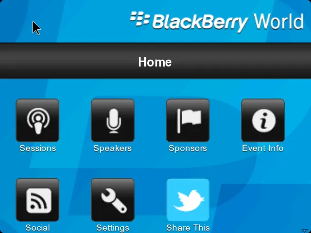
The first thing I noticed was that it appears that the only option available to me is the 'Share This' option. All of the other icons appear to be disabled. I seriously spent the 30 seconds or or so trying to figure out why all of the application's options except for 'Share This' were disabled.
Taking a hint from Windows or Mac OS, disabled options usually appear without any coloring so users can easily tell which ones are enabled and which are not – just like most of the icons appear on the screen shown in the figure. There's no shadow or highlighting that would make me believe that those other options were valid. When designing a mobile application, if you're going to have a bright blue icon and you don't want your users to think all of the other options are disabled, you have to use color on each and every icon on the screen. The only other option is to use no color at all – for all icons on the screen.
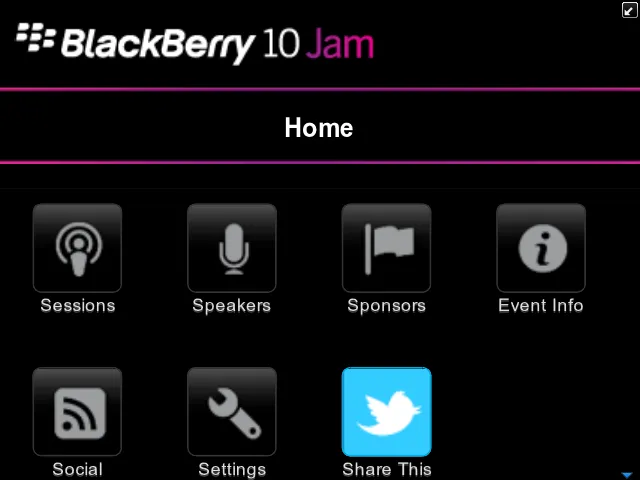
This particular effect is even more prominent in the BlackBerry 10 Jam application shown in the figure below. In this example, the icons look even worse. Clearly nothing except for 'Share This' is a valid option, right? The dull grey tone of the remaining icons on the screen screams 'this option is disabled.'
The next thing I noticed in Figure 1 is that this is a browser application (see the 'mouse' cursor in the upper-left corner of the screen?) The first thing I did was swipe on the device's touchpad to scroll through the options (the icons) on the screen. No can do, the touchpad does nothing but move the mouse cursor. You can touch the screen to click the icons, but if you use the little optical touch pad, all you can do is move the cursor around on the screen (and click buttons). What an inefficient input mechanism.
As a developer, you have access to the touchpad and you could use JavaScript code to take that motion and translate it into something that highlights each icon as you swipe across the touchpad. Even if you didn't have direct access to the touchpad input, you can still track 'mouse' movement and know that the first down motion of the 'mouse' should highlight the first icon (sessions) then as the 'mouse' moves left/right/up/down, move the highlight to the appropriate icon as needed. Oh, right – there is no highlight, all the developer created were these lackluster icons.
Whoever developed this application didn't take into account users like me who has a BlackBerry Bold and didn't want to reach all the way up (no, I'm not lazy) and touch the screen when I could simply use the touchpad. You have to accommodate both input mechanisms – touching the screen and using the touchpad. To ignore one and assume the other is poor application design.
When you scroll down the page, you see what I'm showing in Figure 3. Why did the developer feel the need to use a background graphic that's far bigger than what is needed for the application? When you scroll to the bottom of the icon list, it should stop immediately below the last screen element displayed. It should not take up so much additional space on the screen. There's no need to waste the space like this.

Now, I know the developer setup that background image to accommodate all of the icons that appear after you login. But why not show all of the icons, only disabling the ones that are not active – that way, this scrolling issue goes away and with that little extra effort you would have been able to tell that some icons were active and others inactive.
All that aside, I can't seem to use the application since when I start it, I get the following error and I can't do anything with my schedule.

On the second day of the conference, RIM released an update to the application, but because I didn't get around to updating it. However, it doesn't make sense that you'd need to release a new version of an application in the middle of a three-day window where the application would actually be used. They really should have done more testing. I'm assuming they fixed this particular problem, but I don't know.
I'd hoped years ago that this would be obvious, but I guess I'm going to have to say this out loud: What RIM should do is give me an application in advance of the conference and I'll assess it for ridiculousness as I've done in this series. I'll identify the problems, RIM will fix them and all of you will have a better experience and I get to avoid having to write another 'What were they thinking' article.
It would only take me a minute to point out many of the simple design flaws that exist with each version of the application.
Next and/or Previous Posts
<< RhoMobile & Domino Article Part 1 & 2 Published BlackBerry World Day 1 Begins >>