A Day in the Life

Posted: September 23, 2013 | | Categories: Mobile
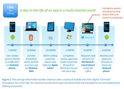
A few months back I was looking at some marketing material for one of our competitors (I don't really remember which one, but I think I have an idea) and noticed the following graphic portraying a day in the life of a mobile worker.

What struck me as interesting is how they portray the different systems this mobile worker uses throughout the day. I understand having a laptop, smartphone and tablet. I expect the smartphone to be used while in motion, the tablet used when more time is available or when more 'stuff' needs to be done and laptop when heavy typing, creative work or just high quantity of mail filing (iOS is horrible for enterprise mail use simply for that reason alone) is needed.
So the worker starts the day on his or her Android smartphone, switches later to a laptop, then tablet, then a desktop? Really? Desktop AND laptop? Next they fire up a Windows 8 device then wrap up their day with the Android smartphone again?
That's not how it works is it? It's highly unlikely that the worker is going to have access to a desktop and a laptop – I expect that in today's economy that the user is expected to connect their laptop when in the office to do work, not use a desktop that's sitting there waiting for him to use it.
From a tablet standpoint, is the employee really going to have both an iOS tablet and a touch-screen Windows 8 device? I think not. Very few organizations are fiscally irresponsible enough to do that.
I understand what they're trying to do, highlight all of the different targets they support, but highlighting all of them as an example of a day in the life of a mobile worker makes no sense. The same story can be told much more effectively by highlighting multiple employees and showing all of the possible ways these employees will need to work with their productivity applications.
Next Post: Nexus 7 Setup on Windows
Previous Post: Silly Bank of America Web Site
Header image: Photo by Eirik Solheim on Unsplash.