 John M. Wargo
Ignoring Mobile Email clients

Posted: February 9, 2013 | | Categories: Mobile
I've always been surprised at how major brands and larger organizations ignore smartphone users in their email blasts. I'm an American Express customer and get email promotions from them on a regular basis. When I open one of their messages, I see something similar to the screen shot shown below.
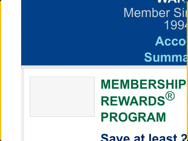
Everyone seems to think that you have to have lots of color and everything centered in an email blast, but at the end of the day that simply doesn't work for mobile users – and I have to imagine that many if not most users read these types of emails on their mobile phones exclusively.
I need to do some testing on this, but since the email is in HTML format, can't it do some work to understand the viewport it's displaying in and adjust accordingly? Mobile users should not have to scroll past a bunch of junk to get to the content and the content should never be centered like it is in the screen shot. That email is useless to me and I simply can't read it on my mobile device without scrolling around to view the content. If I'm reading on mobile, I should see all of the content flush left with natural wrapping.
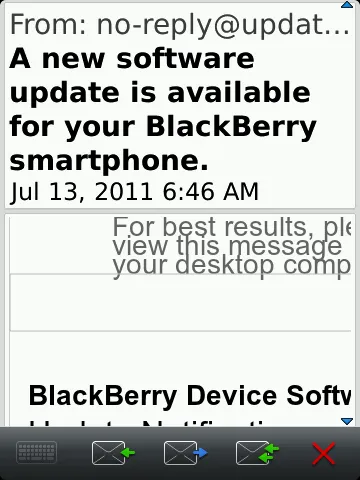
In my mind, BlackBerry was the worst offender – take a look at the following screen shot. This was taken a while ago, but it was an email to BlackBerry users, with specific instructions that the message would look best on a desktop computer. At least they moved the content to the left margin so the email is at least readable on a mobile device.
Next and/or Previous Posts
<< Using jUpgrade Carrier APIs >>
Header image: Photo by Eirik Solheim on Unsplash.