More on Email Message Format for Mobile Devices

Posted: March 4, 2013 | | Categories: Mobile
A few weeks ago I posted an article complaining about how major brands don't consider mobile email clients when they craft their blast email content. I even showed some examples of poor email content design from American Express and RIM. A reader of the site missed the point of my article and suggested I learn how to use my BlackBerry and enable automatic download of images in the email. Apparently he (or she, not quite sure) skipped reading the article and instead simply saw the screen shots and thought I didn't know what I was doing.
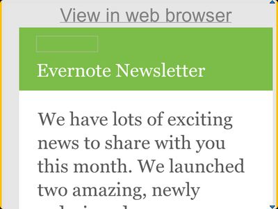
My point in the article is that everyone does fancy email blasts with lots of graphics and centered content. That simply doesn't work for mobile devices and I wrote that post in an effort to get people to start thinking about the target audience and adjust their content accordingly. I noticed the other day that the smart folks at Evernote have it figured out, take a look at the email content in the following screen shot:

Notice that it used color and some font treatments, but that doesn't detract from the email message's readability on a small screen (like the BlackBerry used to take the screen shot). That's the way it should be done!
Next Post: Wi-Fi Only Tablets
Previous Post: Follow-Up Then
Header image: Photo by Eirik Solheim on Unsplash.