Password Pain

Posted: February 4, 2014 | | Categories: Raspberry Pi, Internet of Things (IoT)
I recently learned about a cool web development server for the Raspberry Pi. I want to teach my son about computer programming and this seemed like an interesting way to do it. The server is called Google Coder and it's delivered as a Raspbian image for the Pi. Pretty cool; I'm hoping to learn more about it and write a bit about my findings here.
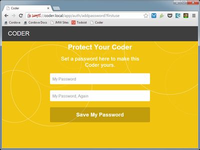
As I set it up and started playing with it, I was hit by one of my pet peeves. First you fire up the server then connect to it via your desktop browser (right, it's not something you use on your Pi, but instead something you host on your Pi and connect to it from your desktop PC). When you connect to the server, you're prompted to provide a password in order to access the system as shown in the following figure.

Honestly I'm really not sure why I need a secure connection to my Pi (notice the HTTPS in the browser's address field) and I'm also not sure why I need a password, but I'll dig into that at some later time.
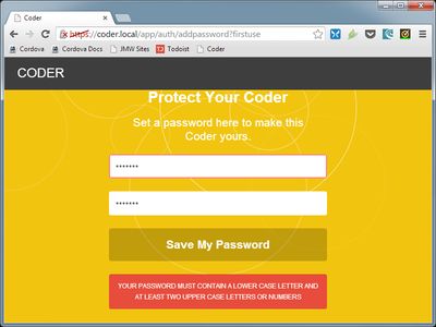
Anyway, so it wants me to use a password so I went ahead and typed on in. After clicking the 'Save My Password' button shown in the figure, what I see next is the following:

There it is – one of my biggest developer pet peeves. If you know that you're going to want me to include upper case, lower case and numbers in my password, why not tell me BEFORE I tell you the password I want to use?
I see this all the time and it makes absolutely no sense to me. You're asking me for input and you know exactly how you want that input formatted, why don't you share that information with me so I can save a little time here? After all, it's not like you have a hidden camera and you can get some pleasure from watching me type in a password only to later learn it doesn't meet your requirements.
Developers, if you have any input, password or any other requirements you're obligated to tell me what they are BEFORE I provide you with the input. There's no other way. You took the time to type in the requirements into the error message shown in the second figure, why not copy and paste the exact same information into the original input form?
I know why it was done this way, some designer designed the password form and it had to look cool and clean. The error warning was an afterthought or was implemented by someone AFTER the design of the password form had been completed. Rather than think through the process and your requirements for the system, they left the input form clean and muddied it up later ONLY if the user didn't accidentally type in a password that met the requirements.
Do your users a favor and think through the whole process before doing the coding. Give the designer all of the requirements so they can be taken into account from the very beginning. That way you'll make happier users.
Next Post: Password Pain Redux
Previous Post: BlackBerry 10 Charging Foibles
If this content helps you in some way, please consider buying me a coffee.
Header image: Photo by Harrison Broadbent on Unsplash