 John M. Wargo
Poorly Designed Web Sites

Posted: September 16, 2014 | | Categories: Stupid Developer Tricks
As look at the world around me, I'm surprised that in the world of the connected, mobile user, that companies are still not thinking of mobile-first users. There are millions or billions of mobile devices sold every year, but companies with public facing web sites still don't seem to notice, and I'm really surprised by that.
The local Charlotte BIG insurance company is Novant Health, and they're usually pretty organized. I was in one of their facilities a while back and noticed that there was free Wi-Fi, so I decided to connect. After selecting the SSID and connecting to the network, I was presented with the confirmation page shown in Figure 1.
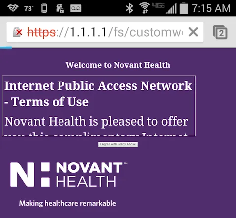
So, what's happening here is that Novant Health recognized that they had a lot of mobile users within their facility and made a conscious decision to provide them with a little extra service (free Wi-Fi) but made no effort to make the confirmation page friendly to mobile devices. Sigh.
If you look at the page, their logo is pretty prominent, but below the fold as it were, so it's not in the way too much. They probably should have used a smaller logo and put it at the top of the page where it is on every other web site they have.
The terms of use section is completely unusable. What's interesting about this is that someone had to go out of their way to format the text so that it would be unreadable on a mobile device. Taking the text and wrapping it with paragraph tags would have allowed the content to fill the available page space and made it easily readable, but the developer who did this tried to put it into a fancy, and I think scrollable, window and therefore made it essentially unreadable by a mobile user. Do you see scroll bars or anything that would indicate to me that I can scroll through the text to read all of it before clicking the 'Accept' button?
That takes me to the Accept button – can you even see it? It's so small, that you might not even know it's there. You have to look really, really close to see that there is an 'I agree with the Policy Above' button below the useless text windows. A button that small would be almost impossible to tap with a finger on a smartphone. Apparently I'm supposed to read the terms of use (I really can't in this window) and click the button I can hardly see in order to be able to use the Novant Health Wi-Fi network.
Like I said, an almost unusable page.
What's interesting is that it's not that hard to make mobile friendly web pages out of something as simple as this small page. There are hundreds, literally hundreds, of HTML frameworks that could be used to automatically adjust the format of this page to accommodate any size browser and any type of device.
Taking the same page content, rendering it as a simple page with no fancy extra windows, just a logo, heading, content and a single button – would take no effort whatsoever. Just do the tiniest bit of research into HTML5 frameworks, pick one then mark up your text (using proprietary tags for some frameworks and simple CSS tags for others) and you're all done. An extra 5 to 10 minutes of work and suddenly your web page works on any device.
For my books, I've recently been doing a lot of work with Adobe Topcoat and, as a CSS-only solution, it's pretty easy to add the classes to your markup to make a mobile Beautiful page in no time. The same could be said for many other frameworks as well.
What I can't understand is why these companies aren't making the effort to do this. It's Wi-Fi, they're giving external users access to a wireless network. They have to know that the majority of users making use of this capability will be doing so from a smartphone or a tablet. There will be some laptops, but in general the majority of visitors won't be bringing laptops with them.
I'm assuming they have some sort of tracking capability; that they can tell what systems are using their network – a little bit of checking would allow them to see what their audience looks like.
What's interesting about this example is that it seems that they didn't think to test the site on mobile devices, otherwise they would have seen how useless this page was. In my case, I was using a Samsung Galaxy S4 device – probably one of the most popular families of Android devices.
Developers – Know your audience and code accordingly. There is no need for fancy, small, scrollable windows on a smartphone device. Just wrap ALL of your page's content in
tags and let the browser render it exactly as it sees best for the device real estate.
Next and/or Previous Posts
<< Where to Find Me @ SAP TechEd && d-code Las Vegas 2014 Bootstrap Complete NavBar Example Application >>
Header image: Photo by Raspopova Marina on Unsplash.