 John M. Wargo
Stupid Web Forms

Posted: April 27, 2015 | | Categories: Stupid Developer Tricks
I'm constantly reminded of how web application designers don't pay attention to the impact their decisions have on their application users. I've written here before about this, but I think it's time to bring it up again.
When designing a form or dialog, it's important to remember that if you're asking users to make a selection when they first access the site, you should make sure to store that selection so that you don't ask them to make the selection every time. If it's something simple, something the user only needs to address once, most web designers allow the user to make the necessary choice, store the resulting decision and move on. The user's not asked again, so it really doesn't matter how challenging the initial form is if the user is only going to ever use it once.
On the other hand, some sites require that the user make a decision or selection every time they access a site or an area in a site. I don't have a problem with that, sometimes it's necessary and the user just has to deal with it. An example of this is shown in Figure 1.
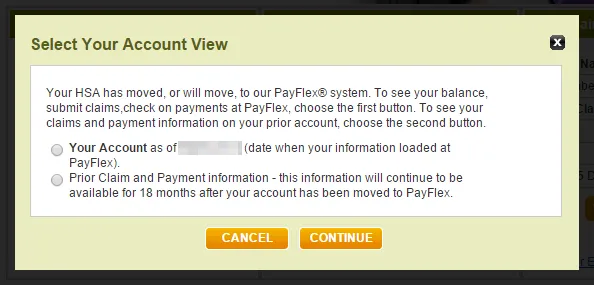
Employees that migrated to PayFlex sometime in the past will need to be able to access their pre-PayFlex data as well as their PayFlex data. Makes sense to ask the user which way he or she wants to go, right?
In this case, PayFlex has implemented this incorrectly. Whenever you login to the site and try to access this area of the site, you have to make this selection. The problem is that after a while, you'll never need to go back to the old system as all of your current activity is being performed with the PayFlex stuff. OK.
The problem I have with this is that the developer who implemented this part of the application didn't make any effort to keep the user's previous selection. It's OK to ask me every time as there's no way for the site to know whether I want to access the old system or the new system. But, once I go down a particular path, it's likely that the next time I access the site I'll want to go the same way again. What they should have done is store the user's decision then preselect that option the next time the user comes into that portion of the site.
If going to the same place, all the user has to do is click the continue button (the previous choice will already be selected) and they're golden. If not going to the same place, then all the user has to do is select the other option and click continue to go down that path. By making this simple change, I eliminate, can potentially eliminate 50% of the selections the user has to make on this form. It's either one click or two clicks, but most of the time it will be only one click.
By not implementing this simple fix, this company is making every single user make a selection before clicking submit – EVERY TIME THEY ACCESS THE SITE. This is completely unnecessary and wastes your user's time. You should always be on a lookout for ways to eliminate unnecessary actions by your users.
<< Email Input on the Web Migration Completed >>
Header image: Photo by Raspopova Marina on Unsplash.