 John M. Wargo
Another Ridiculous Input Form

Posted: April 3, 2017 | | Categories: Stupid Developer Tricks
Welcome to another installment of Stupid Developer Tricks. In this particular instance, I was filling out a form on a particular web site when I encountered the following:
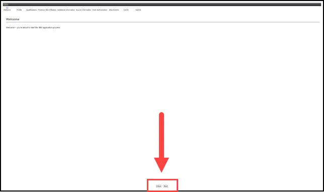
Apparently the 'form' is a wizard and whomever defined the requirements for this particular form apparently decided that the Next and Cancel buttons (highlighted in the figure) absolutely must be in the exact same place on every pane of the process. Unfortunately, I have a 30 inch monitor, so this doesn't work very well.
When the form first appeared, my first thought was that the page didn't load correctly or hadn't finished loading as all I saw was that initial line of text at the top of the page. It was only after checking the browser's activity indicator to see if it was still loading the page, it wasn't, that I started looking at more of the page and finally found the Next button at the very bottom of the page.
Should it be all the way down there? No, not really. It should display near the end of the primary (in this case, the only) content on the page. Forcing navigational elements to the bottom of the page, not matter how much of the page's space is used by content, is a ridiculous use of the page's space. Imagine if this was an input form, and you've been typing away in the form's different input fields, but had to grab the mouse and drag it down to the absolute bottom of the page every time you wanted to move on to the next page in the wizard. This makes absolutely no sense. Don't do something like this in your forms.
Next and/or Previous Posts
<< Hackers Hacking My Joomla Site's Images Folder Ridiculous IBM Password Form >>
Header image: Photo by Raspopova Marina on Unsplash.