 John M. Wargo
BlackBerry Z30 Mail UI

Posted: October 16, 2013 | | Categories: Mobile
I've been carrying a BlackBerry Z30 for some time now and I really love it. The keyboard is awesome and the form factor is perfect – much better than the super-silly iPhone.
Anyway, I do miss the keyboard though. One of the things that has always made the BlackBerry perfect for heavy mail and PIM usage is how the keyboard simplifies so many tasks. Filing a message is as easy as hitting the i key and starting to type the first letters of the folder name and you can file the message in no time. When filing subsequent emails, the last folder used for messages from that thread appears as soon as you press the i key. Android and iOS make this as hard as possible by not allowing you to bring up a keyboard while filing a message. Ugh.
Anyway, as I've been using the Z30, I've noticed how they don't make it easy to delete messages after you've read them. There's no delete key (because there's no physical keyboard) and they don't expose the delete button in the default UI shown at the bottom-right of the following figure.
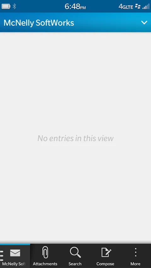
If you want to delete a message, you have to tap that three-button more thingie (whatever that is) and select delete from the menu that appears. Inconveniencing, but I'm OK with it. Although I would argue that delete would be used a lot more than the Search button, so they could switch the position of the two and make a LOT of users happier.
As I looked at the screen, it occurred to me that perhaps if I turn the device sideways, the delete button I need so much would appear (since there's much more room in landscape mode). So, I rotated the device then took the screen shot shown below.
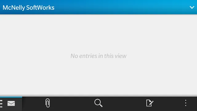
Notice that with all of that additional available real estate, all they did was expand the distance between the buttons. What a waste. With all of that extra room, what I expect is that the most used items from the menu will drop down into that lower menu and be available to me in one click instead of two. Nope, they didn't do that.
This is another example of what happens when developers don't think about how users will actually use their software. It's easier to keep the same buttons rather than make use of the additional space. Too bad.
Next and/or Previous Posts
<< Email Message Layout Revisited My Day Job at SAP with Kapsel >>
Header image: Photo by Eirik Solheim on Unsplash.