 John M. Wargo
What Were They Thinking 13 – VZ Navigator

Posted: April 30, 2013 | | Categories: Mobile Development, What Were They Thinking
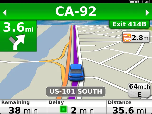
While I worked at AT&T, I became a big fan of the TeleNav Navigator application which later became AT&T Navigator. The interface was intuitive and it worked pretty well. When I joined SAP, they gave me a Verizon BlackBerry 9900 and I lost access to the navigation solution I was accustomed to using. On Verizon, they have their own navigation solution called VZ Navigator; here's what it looks like:
I was using it recently to navigate somewhere and noticed something about the UI that really struck me as stupid, so of course I had to write about it here.
When you press the volume buttons on the side of the device to increase or decrease volume, instead of actually increasing or decreasing the navigation volume (which is what ANY smartphone user will expect), the application instead opens up the dialog shown in Figure 2.
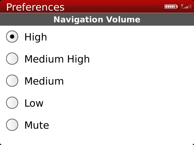
This is simply the wrong way to implement this interface, and, to make matters worse, you can't use the volume controls (those buttons on the side of a BlackBerry device) to move the selection on this dialog. I thought perhaps they simply made a mistake by implementing this dialog, but they compounded their error by forcing me to physically touch an item to make a selection rather than to just allow me to use the volume buttons to move the selection down and up on the screen.
Think about the use case – I'm driving my car and using this application to help me get to my destination. There's background noise in the vehicle, so I'm trying to increase the volume so I can hear better – and the application forces me to take my eyes off the road and make a selection on the screen rather than to simply use the buttons that BlackBerry put on the device to allow a user to adjust output volume. What this 'feature' does is make the application more difficult to operate and deliberately creates a safety issue for the user (and the occupants of the vehicles around the application user).
All the developer had to do was register a listener for the two volume buttons and act accordingly. The developer did register the listener, but instead of implementing expected behavior, they instead broke the application by implementing an unexpected and difficult to operate dialog. This makes no sense to me.
The market in general hates BlackBerry applications, but it's not BlackBerry's fault that this application is unusable – they provided all of the features the developer needed to make this application as functional and beautiful as similar applications on Android, iOS or Windows. The developer is the one that made this application less appealing.
Next and/or Previous Posts
<< BlackBerry Facebook Application Broken The Solution to My Domino Server Configuration Problem >>