 John M. Wargo
Doing Account Creation Right

Posted: July 28, 2016 | | Categories: Stupid Developer Tricks
As I strive to pick up new technologies and start new projects, I'm regularly finding myself registering for new services, accounts or access to specific websites or forums. As part of this process, I've noticed two things:
- Very few web form developers use the (no longer) new HTML input types (https://w3schools.com/html/html_form_input_types.asp) like email, date, time, url, and so on.
- Security requirements force a specific set of minimum password requirements, but web form developers rarely let you know that they even exist, or what they are, until AFTER you've submitted credentials that don't meet the requirements.
In my mind, the first one indicates that the developer isn't thinking about mobile users (which have special keyboards for the specific input types) and isn't interested in making input easier on mobile devices. I wrote a post about this topic and shared some examples, so this isn't the focus of this post.
The second one tells me that developers aren't thinking very carefully through the whole registration process. They seem to feel that the present, populate, submit, validate, kickback, fix, and submit again process is reasonable for registrants, when a simple present, inform, populate, submit, and validate process is much more efficient (see Figure 1).
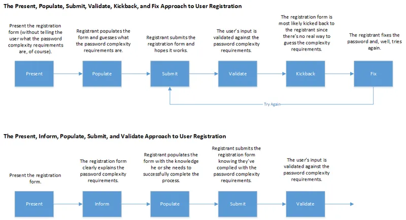
Unless I'm able to somehow divine the password requirements in advance, without you telling me, the registration process most developers implement forces users to submit the registration form twice. I don't have the numbers, but it would be very interesting to see some analytics data on one of these forms to see how often users are actually able to guess the password requirements. For sites with more complex password requirements, I imagine that the number of users who have resubmit is at least 80%.
What developers must do is list any password complexity requirements on the registration form from the very beginning. When you do this, you'll eliminate the majority of your validation errors except for those cases where the user isn't paying attention. I'm experienced, so I know that most sites will have password complexity requirements, so I'll look for details regarding the requirements before I tap the submit button. If I don't find them, which is the majority of the time, I pick a simple password and submit it to see if it will work.
What most developers do, is assume it's OK to tell the users what the password complexity requirements are during the validation kickback process. That works, but it's too late. The user has already made an investment to populate the form using all of the information you provided and you failed him. This approach requires that the user fail before they're provided with the information they need to be successful. If they're successful on the first try, it's because:
- They made a lucky guess
- They're default approach to passwords accidentally meets your minimum requirements
- Your password complexity requirements are not complex enough for most users
The folks at MongoDB recently launched a cloud hosting service (cloud.mongodb.com), and did a really great job on their registration form (see Figure 2). Not only are you told up front what the password complexity requirements are, you can see visually how many of the requirements you have met. That's the way it should be done. At a minimum, list the requirements on the form from the moment it's served. As a bonus, show the user how they're doing as they populate the form.

Unfortunately, the MongoDB folks failed at using the right input types in their form. The email field doesn't use the email input type, so on a mobile device users won't see the email input keyboard. Too bad.
Next and/or Previous Posts
<< Withings – Useless Input form Formatting Email Content for Usefulness on Mobile >>
Header image: Photo by Raspopova Marina on Unsplash.