 John M. Wargo
Formatting Email Content for Usefulness on Mobile

Posted: July 27, 2016 | | Categories: Mobile Development
I posted a little while ago about how marketing organizations were ignoring mobile clients when crafting email blasts and provided some examples (which I continue to update as I find more). My analysis of these emails focused mainly on how the email messages are not formatted correctly for smaller devices, but as I looked into this more, I realized that many of these email messages, not marketing blasts, but specific notification emails sent directly to me, weren't structured in a way that made them immediately useful to me as the consumer. Take the following email notification from American Airlines for example:
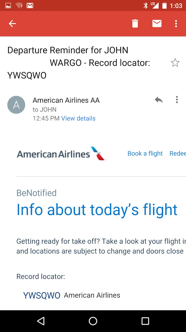
When you look at the email on my Nexus 5x device as shown in the figure, there is no useful information displayed once I open the email. All I can tell by looking at this email is that I have a departure coming up and that it has a specific record locator. The developer who crafted this email message paid no attention to providing me with useful information above the fold (in the first page displayed).
When companies craft notification messages, they need to focus on organizing the content so the reader gets the most important information as quickly as possible. Newspapers and even magazine articles are structured in a pyramid format, with the most important information at the top of an article. They do this so that editors can easily trim the article to fit a particular amount of available space without losing the story; the side effect is that users get more quickly to the important part of the content.
For mobile app content, content creators must focus on getting the user the pertinent details of the notification without forcing the user to scroll the page. As you can see from the figure, there's information there, but it's all (yes, all of it) useless. Users have no choice but to scroll the message in order to see the details.
Let's analyze the email content…
In the subject line, for example, I can see that it's a departure reminder. That's good, I guess, but I probably already know that I'm departing today. That text clarifies whether the email is a departure reminder or some other type of notification, so I guess that's OK, but still not a very good use of the space. Next they tell me it's a reminder for, well, me. This email was sent to my personal inbox, who else would the reminder be for? Why do they have to inform me that the reminder is for John Wargo when they know they sent the reminder to John Wargo's email account?
Now, I recognize that some executives have their travel managed by their assistants, and those assistants may cover multiple executives, so letting me know who the reminder is for, in that case, might be useful. But, of the millions of users who receive these notifications, how many of them are sent to assistants? 1%? 5%? 10%? Should you accommodate the outliers or do you accommodate the majority of your users when formatting notification content? The majority, please; there's no need to remind me that the departure reminder I'm getting is for me. If you're sending me a departure notification for someone other than me, then including the name of the traveler does make sense. So, for example, if sending a notification to my wife, which is something I have setup in my AA account, it would make sense to include my name in the reminder email. But, any departure notification she's going to receive is either going to be for her or for me, so there's still no need to include the traveler's name in the subject line.
Next, the airline included the record locator for the flight I'm being notified about. That's nice, but what am I supposed to do with that information? The record locator is useless information to me at this stage of my traveling experience. I know I can use the record locator to locate my record, and view the details of my current trip, but the app creating this email already had the record open, so why not skip the record locator and actually include details from the record instead?
When you get to the body of the email, American Airlines has decided to include a header graphic that has their logo, plus links to perform actions on their web site. I understand the value of the brand's header graphic at the top of the email, that's expected. But why do they think I need a link that allows me to book a flight at this time? They're reminding me about a flight departure, and, so far no details about the flight's actual departure has been provided. However, I've been given a link to use to do more business with the airline. Does that make sense? Also, as you can see, they didn't format the header so it scales correctly on the page, so other potential useful information is off on the hidden right side of the screen.
Now onto the body of the email. As you can see, the content styling isn't setup to automatically wrap the content to the page width. You're teased that there's details about this particular flight coming up, but as of yet nothing interesting appears except for a repeat of the record locator. Why repeat the record locator when you've not even provided me with any other details about the flight?
So, what details of this flight are important for me to know in this notification? As I thought through this, the following list came to mind:
- Destination City – I'm flying and may have more than one flight today, so probably care most about which leg of the flight I'm being notified about.
- Departure City – Seeing this would help me understand exactly which flight leg we're talking about
- Flight Number – Isn't amazing that the airline has given me the record locator twice, but never once mentioned the flight number?
- Departure gate
- Status – what's the current status of the flight
- Planned departure time – this one and the following could be on the same line.
- Current departure time
- Planned arrival time – this one and the following could be on the same line.
- Expected arrival time
The order should probably be adjusted and some of the items can be listed together, but that's basically the gist of what I need to know about a flight in a departure notification. All (or at least most) of that information should appear on the initial screen that appears when the user opens the email.
For a reasonably sized device, that information should appear without the reader needing to swipe a finger to see more. From what I know about HTML and CSS, that doesn't seem like that would be hard to accomplish, but American Airlines made no effort to do so.
Here's what I would do: For the subject line, I would get the user to the most important information as quickly as possible:
Flight FLIGHT_NUMBER: STATUS, Gate GATE_NUMBER
Or
DEPARTURE_CITY: STATUS, Gate GATE_NUMBER
That's it. I know that I'm flying and I know which airline sent the email, so I really don't need to know anything else in the subject line. With that information in place, I can tell, without even opening the email, whether I need to open the email and read more. If the details in the subject line are complete, there's actually no need to open the email unless I want more details.
In the body of the message, I'd include the airline logo (nothing more) since we do have to maintain the brand. There is no need to provide links to book a flight; I be analytics could prove that that particular link is never tapped on a mobile device. Next would come the specifics of the flight in more or less the order listed above.
Any additional information, including links to do other things with the airline (like book a flight) I would add as links to the BOTTOM of the email. That way, once I've been properly informed, I can scroll down and interact in other ways with the airlines. I would definitely add a promo code to entice the customer to purchase something (like a discounted drink or meal) before the flight.
The best litmus test for app or email UI verification is how many actions does it take to get the user to the exact information they need at the time they need it:
- The best option is none; the user gets a notification, the notification appears in the device's notification area and displays enough information to impart some knowledge to the reader. That's the best approach and not actually that hard to accomplish if you actually work at it. In this case, the user never needs to even open the email or email client.
- Next comes one action; the user has to open their email client. Once the message appears in the messages list, if the subject line is thoughtfully crafted, the user can gain useful knowledge by simply reading the subject line.
- Barely acceptable is two actions; the user has to open the email client and open the email message.
- Unacceptable is what I've shown above; the user has to open the email client, open the email message, AND then scroll down in the message to gain useful insights into the flight's status. I'm assuming here that useful information will be visible after only one swipe, it's possible more than one swipe will be needed to get to the useful information and that would be horrible.
As developers, we have to stand up and be thoughtful in how we impart information in small spaces. The email shown above was created from the airline's perspective; the record locator is how they think of the reservation, so the developer implementing this system applied that same thought process to the message content. She (or he) didn't put themselves in the reader's shoes and organize the content in the way that made the most sense to the content's target. That's a shameful lack of effort in what could be a great opportunity to impress a customer in his time of need.
Next and/or Previous Posts
<< Doing Account Creation Right PyMongo & Google Charts Data Tables >>