 John M. Wargo
Poorly Designed Notification

Posted: May 2, 2016 | | Categories: Stupid Developer Tricks
I really enjoy analyzing apps, notification emails and other technological implementations looking for ways that developers have failed their audience. I like this not because I like to pick on others, but because it helps me learn what not to do in my own app implementations.
I was traveling last week to the Xamarin Evolve conference and received the following text message from my primary airline:
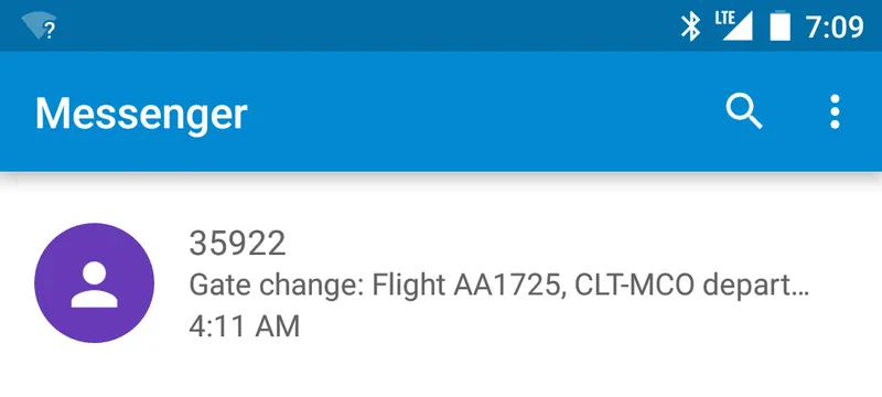
I already knew about the gate change, so I didn't pay much attention to the notification until later when it struck me that American Airlines really failed in getting me the information I needed.
Don't get me wrong, I like getting the notifications, but this one isn't useful to me until I open it. It's telling me there's a gate change, great, useful information. What's the next piece of information I need? Well, I do need to know which flight, but in this case, I only had one flight that day, so telling me what the flight number and the source and destination airport is useless to me. If you think about it, unless you're someone who memorizes flight information, then the only really important information for me is the departure and arrival cities.
Anyway, what's the next most important information? The new gate number. In this example, they're telling me there's a gate change, good information to have. Next they're telling me which flight – good, that's good. The next most important information for me is which gate do I now have to walk to? Remove the flight number and the word 'departing' and there's enough information there to tell me everything I need to know to get to my new gate:
Gate Change: CLT-MCO now Gate 54
Anything else, absolutely anything else, is bonus information. If there's room for it on the messages list, then I'd see it, otherwise I only have to open the message to see the less important information. The way American Airlines has implemented this, no matter what happens, I must open the message to view the most important aspect of the message.
See what I mean? The developer implementing this should have prioritized all of the data and ordered it with primary data first. That would save me the extra click required to open the message.
Next and/or Previous Posts
<< AT&T's Network Couldn't Handle the 2016 Indy Crowd iOS Forcing Me to Delete Mail Messages Twice >>
Header image: Photo by Raspopova Marina on Unsplash.