 John M. Wargo
Epic UX Failure at Bandsintown

Posted: January 22, 2017 | | Categories: Mobile Development
I'm a HUGE music fan, in my car, in the house, or when I'm working, there's always music playing. Having formerly lived near Cleveland, OH, I'm also a big concertgoer and see as many shows as I can. A while back, I signed up for Bandsintown as a way to know when the bands I'm interested in are going to be performing nearby. I don't use the app much, but I have used it to highlight the bands I like. Recently, I've started getting emails like the following:
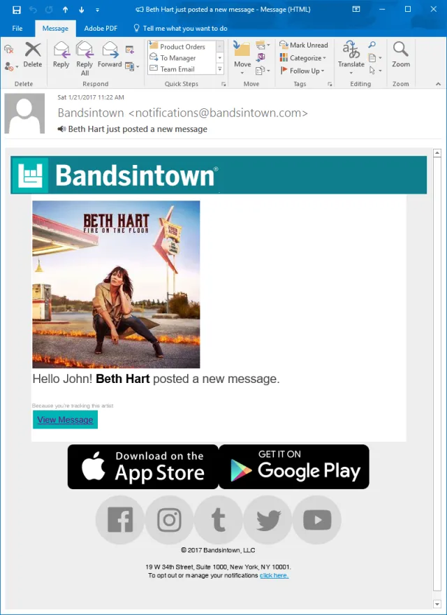
When I saw this, I immediately said: “Oh, I wonder what Beth has to announce.” I'd be much happier if they'd just include the message content in the email to me – after all, why send me a message letting me know I have a message and NOT include the message in the message? That makes absolutely no sense and already Bandsintown is delivering a poor user experience UX.
So, I clicked the link to see what Beth had to say and was presented with the following web page:
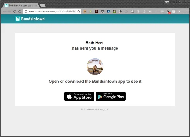
Apparently I don't get to know what Beth has to say unless I fire up the app and see what her message is. I'm not going to do that. They've lost me as a user.
What happened is they they've completely ignored the fact that I might check my email on my PC. In this case, I was. There's no reason to send me to an app, when the medium they're already using supports properly rendering the message. Even if they did want to send me to the app, which would have been an important piece of information to share with me in the original email message, they wait until I click the link and open a browser window before telling me that I can only read the message from the app.
At this point, they lost me as a user since they clearly don't care about me.
Why do they feel the need to force me to use their app? By including Beth's message in the email, they're reinforcing their service in my mind, and increasing the chance that I'll reopen their app. When I'm using my desktop PC to read my mail, there's no way I'm switching to a smaller device with a smaller screen to read this message.
My point here is that when you're developing a marketing campaign or implementing features into your service, you have to pay attention to how people will use it as well as what they'll be doing when they use it. In this case, they've made a faulty decision to assume everyone will be getting this email on their mobile device.
Now, the last time I got one of these messages on my mobile device, I clicked on it, and the mobile app dutifully opened (as expected), but I wasn't taken to the message. Instead the app opened and I found no way that I could actually read the message from the band. Sigh. What a waste of a good opportunity to connect me with one of my favorite bands.
Next and/or Previous Posts
<< Faulty Amazon Purchase Review Process Arduino Twinkle Lights >>