 John M. Wargo
My First Digital Hotel Key

Posted: February 17, 2018 | | Categories: Miscellaneous
I'm staying in San Francisco this week and when I checked into my hotel, they offered me an opportunity to use a digital key to get into my room. That seemed like a fun and interesting thing to do, so I said yes and began the process.
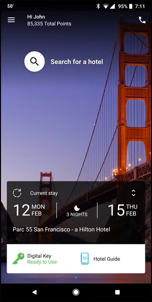
For some bizarre reason, Hilton requires some legal process to get my key; I had to agree to some terms in order to use this option (I don't understand why, and I didn't read them before I accepted them). I eventually got an email letting me know that my digital key was being generated and would be delivered to my phone (actually the hotel app on the phone) once my room was ready. When I got to my hotel and opened the app, I saw what you see in the following figure; a button in the lower-left corner with an option to open my room using the app. Nice!
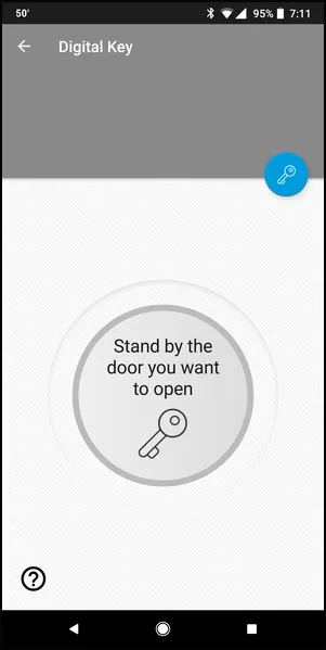
When I tapped on the key, I was instructed to get close to the door I wanted to open as shown in the following figure. I'm assuming it's using Bluetooth Low Energy to detect if I'm close to the door, and hopefully it knows which door I'm close to.
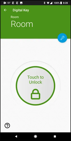
Once the system recognizes the phone/app, the page/screen changes to a button you can use to actually open the door. God forbid that you'd be in a hurry, as this process takes much longer that it takes to pull a key out of your pocket and use it. If there was a rapist or robber on your tail, you'd be a victim before you could ever have the door open.
The challenging aspect of this feature is that this process only works when all of the intermediate parts work as well. When I got back from breakfast this morning, I opened the app and the app hung with a incompletely rendered screen. After poking around for a short while (closing and reopening the app a couple of times), the app finally told me that there was a problem and it was on the hotel's end of things. Comforting information, but not even at all useful as I'm standing outside my room and can't get in. Sigh.
The problem eventually resolved itself and I could get into the room, but what options did I have in light of this failure? Call the hotel and hope they could get me into my room remotely? Would they even do that? Doubtful. I imagine they'd either send someone to the room with a key or I'd have to traipse down to the hotel lobby and get a physical key. Either way I'd probably have to prove who I am even though the app knows who I am and where I am.
When I went to the gym this morning, a sign outside the door said I could find the fitness room key in the app. I'd not seen an option for that in the app, so I stood outside the fitness room for a few minutes fumbling around in the app until someone left and I could just go in their the opened door.
It turns out that that little unlabeled blue key icon on the middle-top right of the screen opens some options for the key system. You can either access your room key or the key manager (whatever that is).
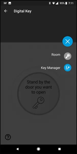
I only needed one key, so I had no idea what the key manager would be used for. I imagined I'd use it if I needed keys to two rooms (when I'm traveling with my family for example). Well, this inappropriately labeled option grants me access to other keys I'll need when I'm staying at the hotel as you can see from the following figure.
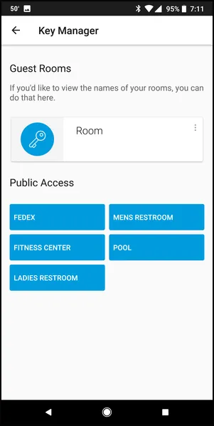
From a UX standpoint, the list of public keys should not be hidden away under a double sub-menu, those options belong on the bottom of the main key screen or under a separate, but easy to locate, tab on the key page. It should take one tap, or at worse two taps, to get to the fitness center key. In this app, it costs me three taps at a minimum, but only if I'm able to figure out in a hurry what that key icon means to me.
Should that icon be a key, or something that says “other keys”? Which would enable the app user to get to other keys the most quickly? Yeah, the latter option. Even using a single key icon here is misleading, a simple icon with a stack of keys or a key ring would have helped me understand more quickly what that particular button was for.
This system works, more or less, but could use some TLC (tender, loving care). This process is a great example of what happens when the person who designs and implements a system didn't take the time to validate the UI with the everyday user. A little time with actual users would have helped them understand that the UI metaphors they selected simply didn't work.
Next and/or Previous Posts
<< Editing Content in Screenshots American Airlines Flight Summary >>
Header image: Photo by Marcos Paulo Prado on Unsplash